|
|
Post by Mystery on Oct 13, 2005 15:05:13 GMT -5
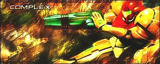
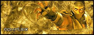
 Tried some abstract brushing tell me what you think... Im thinking about a render to add though ;D |
|
|
|
Post by GIZZLE on Oct 13, 2005 17:43:06 GMT -5
Ooooooo Awwwww.....That dont need a render...ITS AWESOME!
|
|
|
|
Post by Mystery on Oct 14, 2005 11:20:26 GMT -5
wow thanks ;D
|
|
|
|
Post by Mystery on Oct 15, 2005 9:24:26 GMT -5
my newest:  |
|
|
|
Post by Flux on Oct 15, 2005 11:11:58 GMT -5
my newest:  not bad man,a little too bright,white spots are TOO bright. you may want to adjust the contrast and add a few more brush strokes to add depth. nice job tho.keep it up |
|
|
|
Post by GIZZLE on Oct 15, 2005 13:13:11 GMT -5
Whoa....Flux knows banners way more than me. Ilooked at it and thought...HOLY s**t! Thjen read his post and was like, yeah, that could help.
NICE JOB!
|
|
|
|
Post by Flux on Oct 15, 2005 16:01:18 GMT -5
|
|
|
|
Post by Mystery on Oct 15, 2005 17:55:48 GMT -5
yeah I had it a little darker but thought neh it'd look cool in something bright  Thanks for the advice ;D |
|
|
|
Post by Mystery on Oct 17, 2005 10:06:46 GMT -5
|
|
|
|
Post by GIZZLE on Oct 17, 2005 17:45:07 GMT -5
NICE BRO!!!
|
|
|
|
Post by Mystery on Oct 25, 2005 15:22:42 GMT -5
 Thought I'd try a different style and make a multi-colored sig |
|
|
|
Post by Mystery on Oct 27, 2005 14:04:33 GMT -5
My very newest:  and one I made out of boredom in 10 minutes.  |
|